5 tips to brief an Interior Designer

By | Blog

5 Interior Designer briefing tips to make your money go further

The first post in our new series is all about Client Briefing. The purpose of a Client Brief is to communicate what you want to achieve with your space to your interior designer in complete detail. It is imperative that this is as detailed as it can be to eliminate the chance of miscommunication or misunderstanding.  This is one of, if not, the MOST important things you will have to do when getting an interior designer on board for your project.  But don’t worry if this is something you struggle with.

When you get to the Client Briefing stage, it is our job as the designer to inform, suggest and educate so that both parties can actively work together and achieve the best outcome. It should be the foundation for any design project and it is certainly an important part of our process . 

Designers will usually help to develop the brief with the client. We have highlighted 5 key focal questions in order to help you develop your own brief before more in-depth analysis. You will have the idea of the concept which you are developing and the location where you believe this will be successful. This is the catalyst to developing the brief. It is important to note that your brief is unique to you meaning that the questions should be tailored to your specific needs.
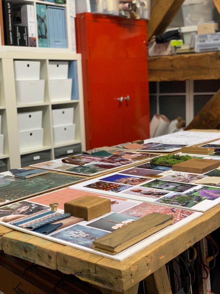
 

mood board planning

We love it when a mood board comes together


1. What is your typical customer?

You need to know who the concept is aimed at in order to design accordingly with their needs and aspirations.

2. Who are your competitors?

You should take time to research your competition. This will help you determine how your proposed customers are currently being serviced and how you can improve on that. 

3. What do you want to be known for?

This is where you can dissect and develop the identity for your project and what the brand culture will be. How does this then relate to the customer and their experience. Think of what you want to be known for.

4. Budget

Realism is the key here. We believe that it is paramount to get the concept, design and layout right first. We recognise if a budget doesn’t suit client expectations but there are always avenues to explore alternative options. 

5. Are you considering a nook for customers to utilise for Social Media (selfie wall)?

Something like the angel wings at Dirty Martini or Birmingham’s newly refurbished Wagamama with the neon ‘nice buns, bab’ sign. Think of something unique that is on brand that people may like to take a selfie with.
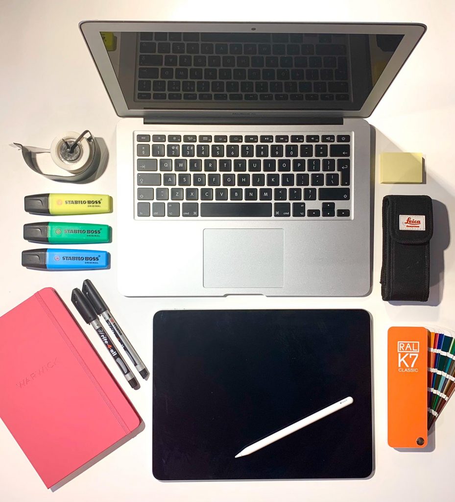
 

 client briefing set up


Let us know your interior ideas in the comments, we would love to hear from you!

Fiesta Del Asado Argentinian Restaurant – Solihull

By | Blog

Spencer Swinden’s design team have been busy transforming a space, which once was a small supermarket on the Shirley high street, into a tranquil fine dining oasis. This space has become the Lasan group’s second Fiesta Del Asado restaurant, specialising in Argentinian cuisine.

The goal was to design a space of ‘effortless escape’ and ‘understated luxury’ – quoted from an article written about the new restaurant by food critic Paul Fulford – read here.


Concept Art

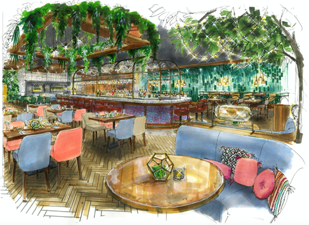
Starting with a blank canvas and a vision, Spencer Swinden designers accepted the task of cutting away a slice of authentic Argentina and placing it in the heart of Shirley.

Argentina, well known for its culture, natural wonders and of course, colourful Buenos Aires, is a country who is second to none when it comes to their expertise on steak and wine. A healthy combination of these things inspired the approach to designing the interior of Fiesta.

The vibrant blues and greens echo the colours of the ocean which, sat next to the blush pinks, powder blues and splashes of gold, mimic exquisite Argentinian sunsets. A choice was made to curve the wall on the right-hand side of the restaurant. Not only does this give a cosy aspect to the wide dining space, but it succeeds in echoing the gorgeous ‘Igazu Falls’ which separates Argentina and Brazil, using a ‘waterfall’ of differing tones of green.


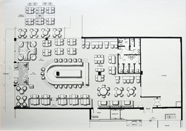
Interior of Restaurant Floor Plan


The Bar was essential to the flow of the restaurant.  Mel’s goal was to create a sense of flow that encourages customers to explore the venue due to the various seating options. Her biggest challenge, she says, was capturing an element of intimacy within such an open plan space. The curve at the front of the bar is to encourage this movement and exploration. 

Mel and her designers are so very pleased with how the interior of Fiesta Del Asado has turned out and completely overjoyed to have their name attached to this exciting project.


Fiesta Del Asado :

177 Stratford Road, Shirley Shopping Precinct, Shirley B90 3AX.

https://fiestadelasado.co.uk/solihull/


Gas Street Social enjoys repeated exposure

By | Blog

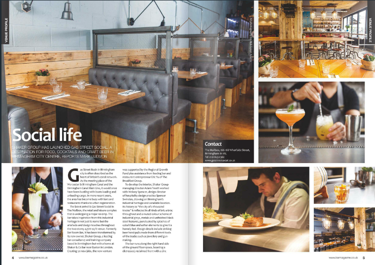
The latest issue of Bar Magazine is out now – with its main feature spread given over to yet more exposure for Birmingham’s top new meeting and eating place Gas Street Social.

Gas Street Social_exteriorEditor Mark Ludmon has penned three pages on The Mailbox’s latest arrival peppered with 10 stunning images – marking the latest publicity coup for the upmarket bar-restaurant set up by Adam Freeth‘s Shaker Group.

That follows whole forests of exposure in the likes of the Birmingham Mail, Birmingham Post, BigHospitality and Midlands Insider, and gigabytes of social media sharing and commentary.

But that’s what clients have come to expect when they work with us, because of our stunning design that creates social spaces with crackling soul to draw in their target customers for experiences they crave and want to repeat again and again.

Gas Street Social_Social Swizzle 1That’s our passion – to ‘transform spaces into profitable spaces’ by designing venues that customers love which in turn deliver commercial results for the operator.

We do this by starting with the audience that a venue wants to attract, studying their nature and the competition. We then come up with a concept that will inspire customers to come and have a good time, to get people talking and to create loyalty, positive reviews and somewhere to return to.

So, as usual, we did lots of research into the demographics of the Gas Street Social area and audience and eyed up the rivals to look for a niche in the market before we designed anything.

Then, with Adam, we agreed on a modern bar-restaurant with a nod to Brum’s industrial heritage and rich history using views over the canal network – more extensive than Venice.

With the concept confirmed, we could go wild on numerous quirky design details and a plethora of bric a brac artefacts from ‘the city of a thousand trades’.

Gas Street Social_foodSo, guests enter to be assaulted by the dramatic open kitchen with chef’s table and hanging metal unit finished with reeded glass in the centre of the space.

A bar runs along the right hand side of the ground floor space and boasts a distressed, reclaimed bar front with a zinc top. Meanwhile the back bar is tiled using scaffolding boards, just one of the venue’s features to boast upcycled materials.

We expressed the ‘1000 trades’ theme further through a muted colour scheme of industrial greys, metals and unfinished black steel features, punctuated by splashes of cobalt blue throughout.

Gas Street Social_beer tapsImpressive hand pulls feature recognisable tools from the trades of Birmingham, such as the jewellery and gun industry, as do (literally) off-the-wall knick-knacks.

We included varying height booths and seating for 120 diners with plenty of mingling space for those just sharing a few drinks to make Gas Street Social a vibrant venue that people enjoy. In addition, a large sharing communal table straddles a pre-existing structural column in the venue next to a grab-and-go coffee area.

It has all combined to create pre-launch hype and expectation, matched by bookings aplenty and rave reviews since, with customers sharing their ecstatic experiences virally.

All in all, the perfect recipe for a profitable new venue – which is all that we ever want to hear we’ve helped to create!

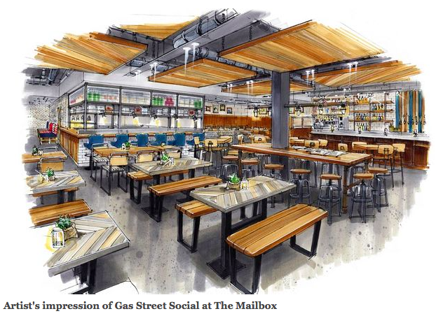
Artist's impression of Gas Street Social

Among the Movers and Shakers

By | Blog

You don’t buy a dog then bark yourself. I should know as I’ve got two big ones and you’ll never catch me barking!

So I love it when a new client hires us, then genuinely listens to and adopts our thinking and opinions on how to transform their space into a profitable place.

And it’s doubly satisfying when the client already has a wealth of experience in bars, casinos and venues from London to Johannesburg via Dubai and big plans to roll their new concept out across the UK.

That’s how it’s been from day one with husband and wife team Adam and Theresa Marie Freeth of Shaker Group and their new restaurant and bar in Birmingham’s luxury retail and leisure destination, The Mailbox.

And that’s how Pomp & Ceremony with all its quirky British eccentricity became Gas Street Social, an upmarket bar-restaurant inspired by Birmingham’s cultural and industrial heritage that will launch to an expectant audience next month.

But I’m getting ahead of myself in the excitement, now that build has finally begun, heralding the final phase of the £750,000 transformation of the 4300 square foot former Bar Room Bar venue.

Adam first contacted us on a recommendation from a colleague and we met to develop the concept.  We became involved last March and did a lot of research into the demographics of the area before we ever thought about design.

That’s how we work because it’s got to be all about the customer and creating an experience that inspires them.  That’s the approach that’s transformed the fortunes of many a venue we’ve worked with over the past seven years.

So we develop a complete ‘venue metamorphosis’ incorporating not just a unique and intelligent design concept, but an entire new brand and customer experience based on location, demographics, history and image.

We then work with the customer to put together a finished brief and overview from both a commercial and customer’s perspective taking into account budget constraints.

Only then do we create unique and intelligent designs that turn a venue into a commercially focused work of art that customers want to be a part of.

We then work with the client through detailed design and drawings, build and fit-out to ensure the initial brand vision is actually delivered.  And even on into aftercare and consultancy on staff selection and training, food and beverage quality and menus, marketing, finance and back office systems.

And so that’s how it’s been with Adam since day one. I don’t want to give too much away with launch still a few weeks off but let’s say that the design is true to the visual.

Word is already getting out via social media and the traditional grapevine and this is how the Birmingham Post reported it late last month.

That was when work began on site with main contractors Approved Shopfitting and Interiors after a full strip out of the entire two-storey venue, including all of the walls and staircases!

We’ve designed everything very open plan to give maximum views over the canal and the dramatic open kitchen so you can see your food being prepared.  We’ve gone for cobalt blue highlight in the venue against a muted colour scheme of industrial greys, metals and unfinished black steel features.

There’s loads of quirky interior detail that we’ve had a ball assembling, including a distressed reclaimed bar front with a zinc top running along the right hand side of the ground floor. We’ve also added hand pulls made from recognisable tools from the trades of Birmingham; such as the jewellery and gun industry.

But that’s all I’m going to give you for now.  You’ll just have to check in for the next instalment of this blog and progress on the fit-out – and book now for the restaurant from 5pm on Thursday 19th March onwards.